9 Art History Movements to Inspire Your Branding Color Palette
- Brittini hostyn
- Apr 15, 2021
- 4 min read
Updated: Apr 23, 2021

When you think of different movements in art history, the key factors that stand out are subject matter, shapes, and uses of color that showed up in almost every piece of art. The color palettes of various art movements stuck around and were so popular for a simple reason: because they worked. Beyond that, however, they also represented certain emotions of the time. Does that mean that you can also reflect specific emotions and moods with the colors you use in your branding? It sure does!
When it comes to your branding, tapping into people’s emotions with the problems you solve and forming emotional connections with consumers can make a big difference to your brand growth and brand loyalty from clients. In fact, Consumer Thermometer states that 64% of women and 68% of men have felt an emotional connection with a brand, with over half of surveyed people reporting that they feel trust in brands when they form emotional connections.
So today, we are celebrating emotive art movements from history and using them as inspiration for branding. Specifically, we have come up with 9 different color palettes drawn from various art movements to help inspire you when developing your brand colors!

1. Baroque (1600s-1700s)
The Baroque style of Europe was all about creating a sense of awe, by using great contrast, movement, and deep, rich colors. This deep coloring is a great way to create a sense of grandeur, richness, and exuberance in any design.

2. Roccoco (1730s-1760s)
Sometimes referred to as the Late Baroque period, this art style also attempts to capture grandeur, richness, and movement. Yet, in contrast to the previous period, Rococo includes far more elements of nature with natural shapes and colors used to create detailed ornamentation and a greater sense of opulence and playfulness.

3. Neoclassicism (1760s-1850s)
This movement began as a reaction to the frivolity and opulence of the Rococo age. Instead, it uses clean lines, smooth paint surfaces and crisp depictions of light and color. It attempts to recapture the feelings of classical art, along with the history, intelligence, and strengths of the past.

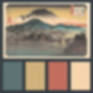
4. Edo Period Japanese Art (1603-1867)
While this period crossed a large span of time with many different styles included, certain elements were incredibly popular in Edo Japanese art: bold compositions with simplified objects, repeating patterns, showy designs, and a playful spirit. In short, it takes the simple and makes it beautiful and full of life.

5. Impressionism (1867-1886)
The Impressionist movement was all about freedom in brush strokes and colors, and often the notable painters of this time would paint en plein air outdoors, in an attempt to capture the movement, transience, and real-life effects of sunlight. Capturing these real-life scenes of nature in their natural settings with realistic colors creates a playful, yet calm and serene mood in many of the works of this movement.

6. Post-Impressionism (1886-1905)
The most famous Post-Impressionist painter is of course Vincent Van Gogh, and what do most people think of when they think of his art? Blues, yellows, and emotions through movement. In fact, the natural movement of light and colors was a main characteristic of the whole art period. And with so many pieces of Van Gogh’s focused on starry nights, there is a dreamy quality reflected in the deep color palettes used in his paintings.

7. Fauvism (1905-1910)
Despite being quite short-lived in the grand scheme of things, Fauvism was a movement made to make a big impression: this style was created to reject realistic images in art, and instead strove to use big, bright and contrasting colors (such as oranges and blues) to create an emotional impact that wasn’t necessarily tied to what the subject, but how the whole experience makes the viewer feel.

8. Bauhaus (1919-1933)
This movement was focused on aesthetics combined with functionality: it strove to unify the principles of mass production along with artistic vision. The inclusion of architectural lines along with a frequent use of primary colors creates a feeling of tried and true methods, blended with innovation and creative spark.

9. Pop Art (1950s-present)
When you think of Pop Art, you probably think of big, bold images and colors with clear ideas. It aims to be seen and make a bold statement, while also trying to blur the distinction between “highbrow” and “lowbrow” culture. That is, it aims to be of quality, while also remaining relatable to the general public, not just the upper class.
Which of these styles are you most drawn to? Let us know!
It really shows that you can find inspiration anywhere, if you just take the time to sit down and let yourself make emotional connections to the things you see in the world around you. When it comes to your branding, don’t be afraid to stretch your imagination to unlikely places, and you may just find that aha! moment that makes everything click for how to express everything you want with your brand.
Looking for more marketing insight and news? Sign up for the Fox & Forth newsletter.
